Co-varying neighborhood analysis identifies cell populations associated with phenotypes of interest from single-cell transcriptomics
·Comparing population composition among samples
This is always kinda the ultimate goal of scRNA-seq analysis to compare and contrast between biological samples. So far, we have overcome the tremendous hurdle 1) normalise technical noises (CCA) to merge samples together, 2) formulate trajectory (pseudotime, RNA velocity) over time-series data. Now, we come to the places where comparison of cluster size based on different conditions was deemed precarious back in 2019 and we finally find a way to do it.
This is why I am very keen to read in more details of this paper of Reshef et al: Co-varying neighborhood analysis identifies cell populations associated with phenotypes of interest from single-cell transcriptomics, and the method paper.
The author has build a framework on how we can compare samples based on their population compositions. This methods also identify some underlying factors that alter the growth and shrinkage of certain cell types. This is super interesting as lets dive in.
digest of CNA workflow

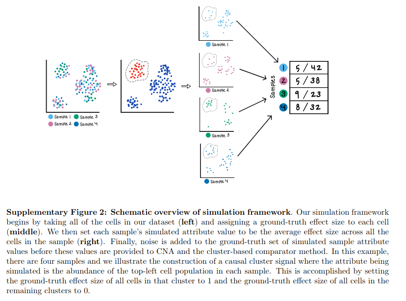
So the CNA analysis starts from a integrated Umap of multiple samples which have overlapping clusters. From there, a cell-cell distance matrix is built and each cell is called a “neighborhood”. This is a new way for me to understand the clustering process, and it looks like this will be a better refinement as it give the probability of a cell belonging to a particular neighborhood.
From the CNA introduction tutorial, we need umap “X_umap”, and a metadata file “obs” specifying the origin of each cell.
import numpy as np
import matplotlib.pyplot as plt
import pandas as pd
import scanpy as sc
import cna
np.random.seed(0)
import anndata as ad
d = ad.read_h5ad('data_anndata.h5ad')

from multianndata import MultiAnnData
d = MultiAnnData(d)
d.obs_to_sample(['case','male','batch'])

d
#AnnData object with n_obs × n_vars = 10000 × 50
#    obs: 'id', 'case', 'male', 'batch'
#    uns: 'neighbors', 'sampleXmeta'
#    obsm: 'X_umap'
#    obsp: 'distances', 'connectivities'
I am new to this multianndata object in python, but it looks like those single cell objects used in R; and since they use scanpy, so it my follow the scanpy format. Here we have 10000 cells with 50 samples. d.obs shows a table of the metadata of each cell (10000 rows x 4 columns). d.samplen documented that the cells come from 50 samples (25 case + 25 controls), pooled from 4 batch of data. d.obsm[‘X_umap’] is a matrix of 10000 cells x 2 coordinates; CNA input data is a normalised multi-sample-clustering graph.
As mentioned in the tutorial section 2.2, cna used scanpy to build the umap and neighborhood (cell-cell similarity matrix).
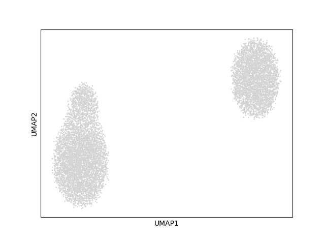
d.uns[‘neighbors’] showed that there are 15 main clusters? in the dataset but looks like is mainly separated into 2 main group in the umap.
Then, we can use the umap to run CNA and identify important conditions that cause certain “neighborhood” patterns.

The association function
# perform association test for case/ctrl status, controlling for sex as a covariate and accounting for potential batch effect
res = cna.tl.association(d,                   #dataset
            d.samplem.case,                   #sample-level attribute of intest (case/control status)
            covs=d.samplem[['male']],       #covariates to control for (in this case just one)
            batches=d.samplem.batch)        #batch assignments for each sample so that cna can account for batch effects
d
#AnnData object with n_obs × n_vars = 10000 × 50
#    obs: 'id', 'case', 'male', 'batch'
#    uns: 'neighbors', 'sampleXmeta', 'NAM.T', 'keptcells', '_batches', '_filter_samples', 'NAM_sampleXpc', 'NAM_svs', 'NAM_varexp', 'NAM_nbhdXpc', '_M', '_r', '_covs'
#    obsm: 'X_umap'
#    obsp: 'distances', 'connectivities'

dir(res)
#['__class__', '__contains__', '__delattr__', '__dict__', '__dir__', '__doc__', '__eq__', '__format__', '__ge__', '__getattribute__', '__gt__', '__hash__', '__init__', '__init_subclass__', '__le__', '__lt__', '__module__', '__ne__', '__new__', '__reduce__', '__reduce_ex__', '__repr__', '__setattr__', '__sizeof__', '__str__', '__subclasshook__', '__weakref__', '_get_args', '_get_kwargs', 'beta', 'fdr_10p_t', 'fdr_5p_t', 'fdrs', 'k', 'kept', 'ks', 'ncorrs', 'nullminps', 'nullr2_mean', 'nullr2_std', 'p', 'r2', 'r2_perpc', 'yresid', 'yresid_hat']
In brief, this step takes the distance matrix and performs a transition process for s steps. In the paper, the authors define 1 neighborhood per cell, so here we have 10000 neighbourhoods.
After defining the neighborhood size for each sample, we obtain a size x neighbor matrix (50 x 10000). It is the neighborhood abundance matrix (NAM).
### nam function
filter_samples=None
nsteps=None
max_frac_pcs=0.15
# compute and QC NAM
npcs = max(10, int(max_frac_pcs * data.N))
NAM = _nam(data, nsteps=nsteps)
### _nam function
# creates a neighborhood abundance matrix
maxnsteps=15
s = pd.get_dummies(data.obs_sampleids)[data.samplem.index.values]
### get a one-hot encoding according to the sample grouping - 10000-cells x 50 axis
C = s.sum(axis=0) ### each sample have 200 cells
prevmedkurt = np.inf

### diffuse_stepwise function
# find connectivity/distance matrix
a = data.obsp["distances"]
# normalize
colsums = np.array(a.sum(axis=0)).flatten() + 1
### totoal distance percell?

# do diffusion
# evaluate in each step in the _nam function
### for each step
import scipy.stats as st
s = a.dot(s/colsums[:,None]) + s/colsums[:,None]
### yield s go to evaluation
medkurt = np.median(st.kurtosis(s/C, axis=1))
print('\tmedian kurtosis:', medkurt+3)

### step 1: median kurtosis: 19.662861178585644
### step 2: median kurtosis: 14.003693083933562
### step 3: median kurtosis: 10.345262720062836
### end of diffuse_stepwise function
snorm = (s / C).T
snorm.index.name = data.samplem.index.name
###end of _nam function
NAM=snorm
The key working part before defining NAM is to build the transition/diffusion matrix of the 10000 neighborhood.
First, a dummy binary category matrix s is made. It indicates whether the cell belong to a sample (1) or not (0).
C=s.sum(axis=0) show that each sample(column) has 200 cells.
It starts with the original cell-cell distance matrix (a) produced from the Umap.
For each step, we perform a.dot(s/colsums[:,None]) and evaluate the results with medkurt = np.median(st.kurtosis(s/C, axis=1)).
s/colsums[:,None] return the normalised matrix of s divided by the total distances of each cell from a. My assumption is that if the cell is mark with 1 in s (belonging to a sample), it returns a value, otherwise it returns zero.
But I am wrong!!!, non-zero values pop up from the 0 locations; my understandings about dot product and matrix multiplication is to weak to comprehend this!
The paper indicated that prevmedkurt - medkurt < 3 and i+1 >= 3 we will stop the diffusion. So I manually run the step s = a.dot(s/colsums[:,None]) + s/colsums[:,None] three times.
step 1: median kurtosis: 19.662861178585644
step 2: median kurtosis: 14.003693083933562
step 3: median kurtosis: 10.345262720062836
The new concept here is to use Kurtosis to evaluate the number of steps in the diffusion. Normal distribution has a kurtosis of 3. The larger the kurtosis, the heavier the distribution tails. The paper mentioned that "”a large kurtosis indicates that a small number of samples dominates the relevant neighborhood. With increasing time steps, as neighborhoods expand to incorporate more cells, kurtosis decreases.””
>>> s
                 0         1         2   ...        47        48        49
cell                                     ...
cell_0     0.040012  0.007950  0.005010  ...  0.009604  0.022597  0.010783
cell_1     0.000544  0.000634  0.000322  ...  0.000592  0.000604  0.000601
cell_2     0.015032  0.008395  0.005109  ...  0.016296  0.001655  0.006606
cell_3     0.028969  0.008275  0.010065  ...  0.006786  0.024147  0.009431
cell_4     0.002248  0.009485  0.015203  ...  0.007396  0.002322  0.003423
...             ...       ...       ...  ...       ...       ...       ...
cell_9995  0.005583  0.013284  0.024799  ...  0.012423  0.013072  0.035522
cell_9996  0.002066  0.028042  0.002728  ...  0.004278  0.008802  0.056187
cell_9997  0.003461  0.005640  0.012572  ...  0.016208  0.034756  0.051705
cell_9998  0.003229  0.012182  0.004857  ...  0.010383  0.024370  0.012791
cell_9999  0.023165  0.004445  0.007808  ...  0.033307  0.007442  0.106023

snorm = (s / C).T
snorm.index.name = data.samplem.index.name
NAM=snorm
NAMqc, keep = _qc_nam(NAM.values, batches)
snorm is a 50 (sample) x 10000 (neighborhood).
Then further batch-correction were performed on NAM were formed by the function _resid_nam and _svd_nam.
#performs SVD of NAM
def _svd_nam(NAM):
    U, svs, UT = np.linalg.svd(NAM.dot(NAM.T))
    V = NAM.T.dot(U) / np.sqrt(svs)
    return (U, svs, V)

NAM_resid, M, r = _resid_nam(NAM.values,
                                covs[filter_samples] if covs is not None else covs,
                                batches[filter_samples] if batches is not None else batches)
print('computing SVD')
U, svs, V = _svd_nam(NAM_resid)
Singular value decomposition (SVD) is new to me too. “SVD is usually described for the factorization of a 2D matrix A. “
Finally association test is performed.
y=NAMqc
# prep data
y = (y - y.mean())/y.std()
n = len(y)
results
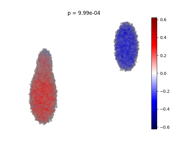
After running the association command, we have an object res and d us updated with new items. The final matrix, res represents “a matrix of samples by neighborhoods whose n,m-th entry is the relative abundance of neighborhood m in sample n”. res.ncorrs is the cells’ “neighborhood coefficient, i.e., color corresponds to the correlation of abundance in each cell’s corresponding neighborhood to case/control status. “.
d.uns[‘keptcells’] indicate the number of cells that are kept for neighborhoods comparison, here 10000 are kept.
d.uns[‘NAM.T’] is a 1000 x 50 matrix of 50 samples to 50 PCs. This is in theory the PCA results of the NAM?
# visualize which populations are expanded or depleted among case samples relative to cntrls
cna.pl.umap_ncorr(d,                           #dataset
            res,                               #cna results object
            scatter0={'alpha':0.5, 's':20},    #plotting parameters for neighborhoods that pass FDR
            scatter1={'alpha':0.05, 's':20})   #plotting parameters for neighborhoods that don't pass FDR
plt.title('p = {:.2e}'.format(res.p))
plt.show()

Results interpretation and thoughts
So the plot is the result after performing NAM PCA, and each cell has a calculated correlation co-efficient of the case/control status.
 # compute coefficients and r2 with chosen model
    ycond = M.dot(y)
    ycond /= ycond.std()
    yhat, beta = _reg(ycond, k)
    r2_perpc = (beta / np.sqrt(ycond.dot(ycond)))**2
However, the linear algebra of these steps are too hard for me to distangle the code. And there are other interesting tests performed in the tutoral. Interested people shall defo have a further look into it!
I think this work is actually ground-breaking and I am very happy to learn some new math concept along the way. Defo have to learn more about linear algebra!